Hello! This is a guide to different shading techniques you can use with dry media like pencils, charcoal or even fineliners (for some of them). I’ve made a note in the image captions of what sort of dry media they’d be suited for, and I’ve also made sure that every image is drawn with a single shade only. When you’re practising shading, it’s a good idea to start out with just one or two shades so you’re practising pencil and pressure control rather than relying on a soft pencil for darkness and a hard pencil for light shades.
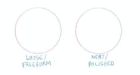
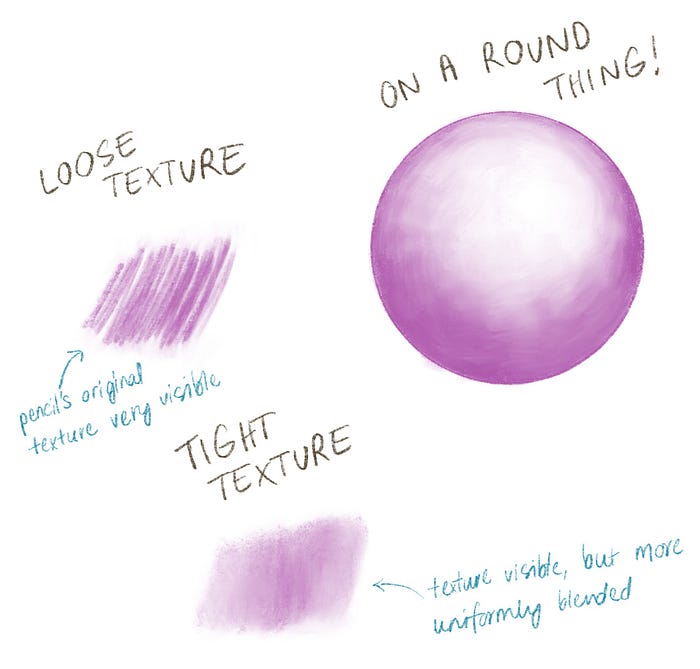
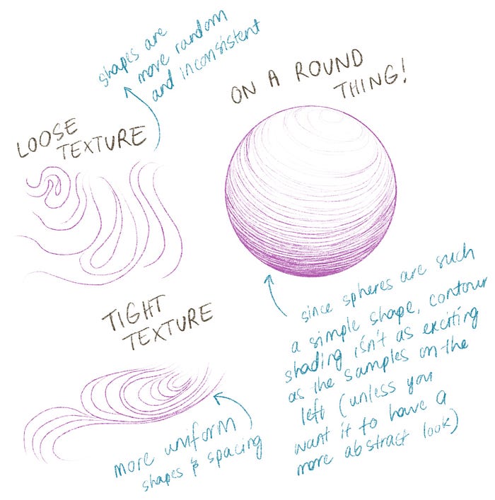
Here’s an overview of what the different techniques look like when on a simple, flat surface:
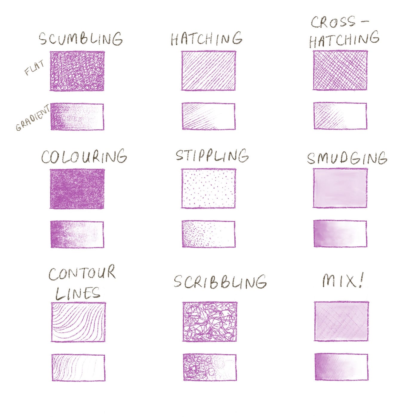
Before we look at each technique in detail, keep in mind that very basically, shading is about how much of the paper (assuming you’re working on paper) is showing through your work. This means your surface and tool choices matter — rough paper will show more through your shading and will give it a looser and rougher look, and smoother paper is easier to do tightly defined shading on (but if the paper is too smooth, like layout or bleedproof paper, it’ll likely give pencil works a shiny finish and won’t be able to take as much pencil pressure). This is not to say that one surface or tool is better than another, but more to keep in mind that using appropriate material makes it easier for you to troubleshoot and self-critique your work. Experimenting with different surfaces and materials is always recommended :)
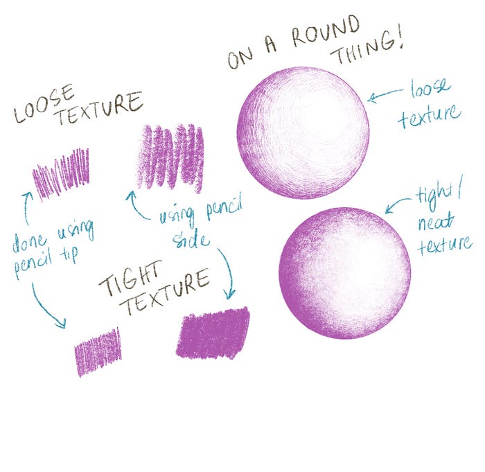
Scumbling
What:
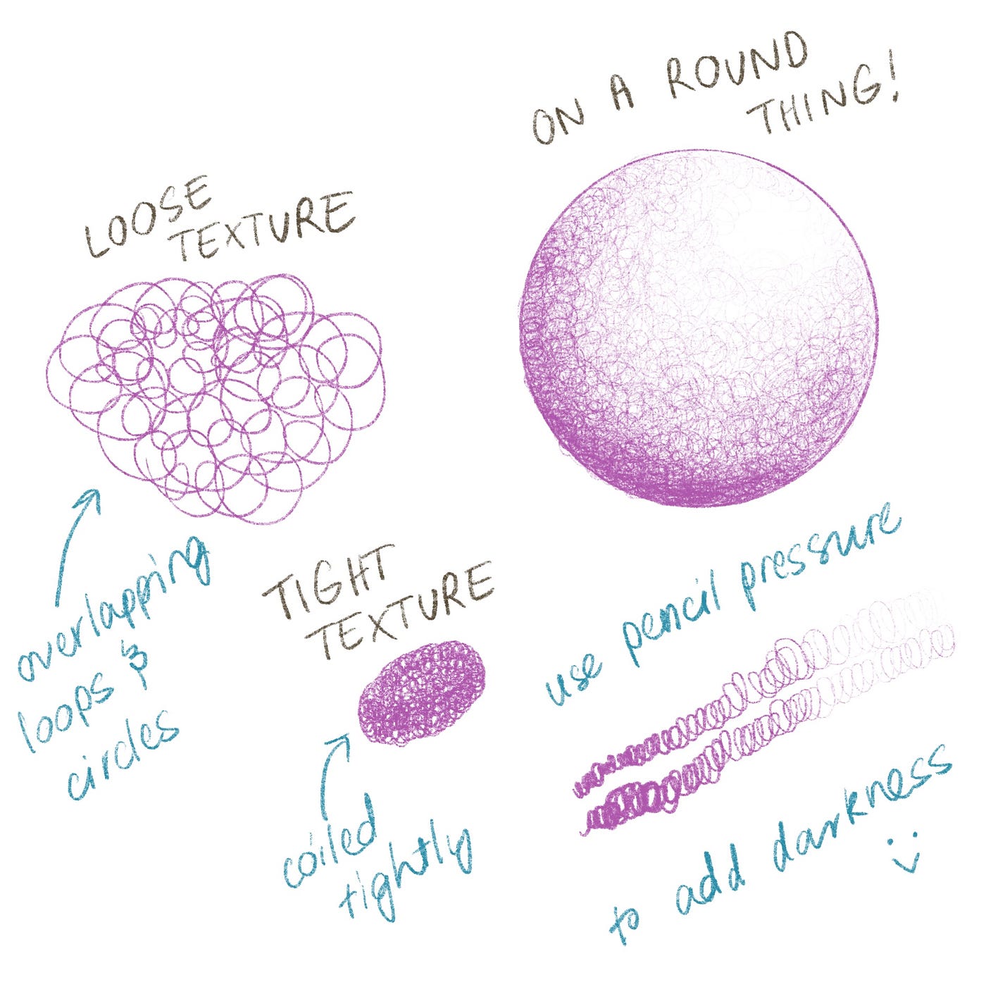
Using many loops and circles to create a textured shade. The smaller and neater the circles, the more controlled and detailed the work. The larger and further apart the circles, the looser and more freeform the result.
How:
Place circles at the darkest areas and work your way out to the lighter areas. You can draw multiple layers of scumbling to add depth to the shading of your image.

Pros and Cons:
Scumbling is great for shading surfaces that have a mild to medium texture, like skin or fruit. The slight unevenness emulates the slight imperfections that natural surfaces have, even in really detailed drawings. The drawback of scumbling is that it takes a long time! You have to either be really patient or just really enjoy the scumbling process.
Hatching

What:
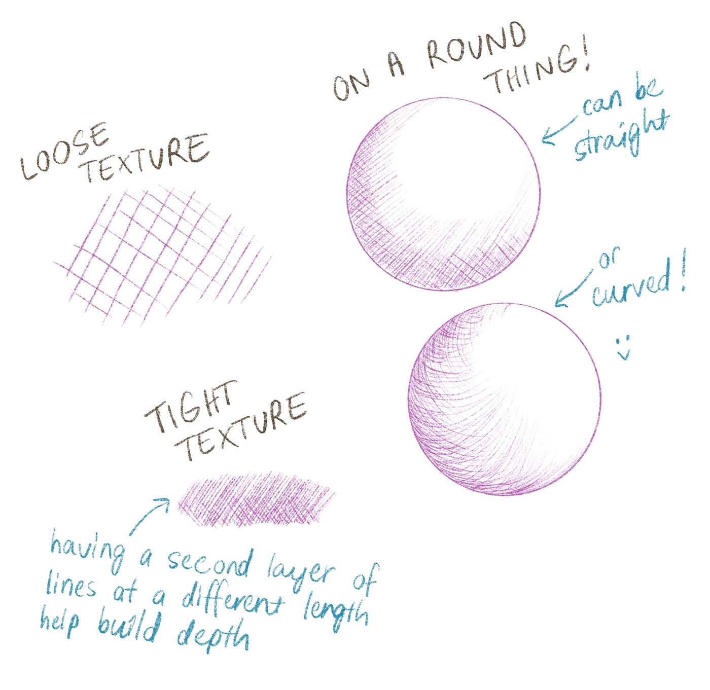
Using many lines that all run generally parallel to each other (they don’t cross over each other at right angles). It tends to produce a more stylised image, but can definitely be used for realism if done carefully.
How:
You can hatch with either straight lines or curved, as long as they don’t interrupt each other too much. Using curved lines is slightly getting into contour line territory but if you’re worked on a curved shape, I think it helps with realism.
Pros and Cons:
This is a quick way to bang out a visual study — much, much faster than stippling or scumbling and honestly what I love using it for. It is less realistic than colouring or blending, but that’s not necessarily a bad thing if that’s not your style anyway.
Cross-Hatching
What:
Similar to hatching, but with a second layer of lines that crosses over the first layer. Tends to produce a realistic image with a feeling of movement (from all of the lines). A nice way to get a sketchy result that’s still realistic.
How:
Like hatching, but with the added step of another layer of lines. While cross-hatching specifically refers to a two-layered style, there’s no rulebook that says you couldn’t add more layers with more directions if you wanted. Looks best if you follow the contours of a shape instead of using straight lines only (for more realistic styles, anyway).
Pros and Cons:
A really beautiful and interesting style that would look great in both black and white or coloured works (for example, for an unconventional look you could do the first layer of lines in one colour and the second layer in another, rather than distributing the colour through the layers evenly). It does take a while to do well though, and since the movements are so repetitive it’s easy to get a hand cramp while using this style. If you don’t like drawing tons of lines (or aren’t yet good at it), this could be a difficult style to go with.
Colouring
What:
The evolved Pokemon form of colouring in! This is colouring, but paying attention to pencil pressure and texture. This style is great for smooth blends, and works well for detailed areas but can be harder to do consistently over large areas with the same colour/shade. Usually used for realistic pieces, and can look polished or more freeform depending on how loosely you colour things in.
How:
A big part of this style is being able to control the lightness/darkness of your pencil, which is difficult to do over larger areas. To help out with this, I tend to colour small sections at a time and match the density and darkness between the borders of each part as sneakily as I can. It helps out if you make the edges of each section a bit softer than the middle parts, so the whole patchwork can blend together nicely.
Pros and Cons:
A beautiful and realistic style that doesn’t take too long to complete (depending on how realistic you’re going with it). Not as fast as hatching, but waaay faster than stippling or scumbling. Doesn’t feel as repetitive as cross-hatching or stippling either, which is nice. The only drawback I can see with this style is that it can look at bit “same-y” when compared with other pieces drawn in the same style — I feel like a bit of looseness adds a lot of personality to a drawing, and the default look of this style doesn’t have much.
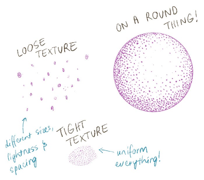
Stippling
What:
Similar to pointilism, this is where you build up layers and densities of dots to create light and dark areas in imagery. Pointilism is used for coloured works that are usually considered to be more impressionist or abstract, whereas stippling can be used to make hyper-realistic imagery and is commonly in a monochromatic colour scheme. This is also separate from Indigenous Australian dot painting, where the dots are more for pattern and texture rather than light and shade (as far as I, a non-Indigenous Australian, understand anyway. Please feel very very free to correct me on this point).
How:
Draw dot, repeat a billion times. Keep in mind that you can create more texture by using different dot sizes that are mixed together. The smaller and more uniform the dots, the neater the final piece. The larger the dots, the faster it’ll be to complete but the more “pixellation” it’ll have.
Pros and Cons:
Depending on how “hi-fidelity” you want the final piece to be, it’ll generally take a very long time. It’s the slowest process out of all of the shading techniques on this page and has been used to create a wide spectrum of styles ranging from abstract to hyper-realistic. The dots from the stippling make for a very convincing skin texture when they’re small enough.
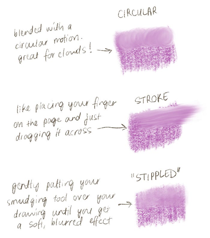
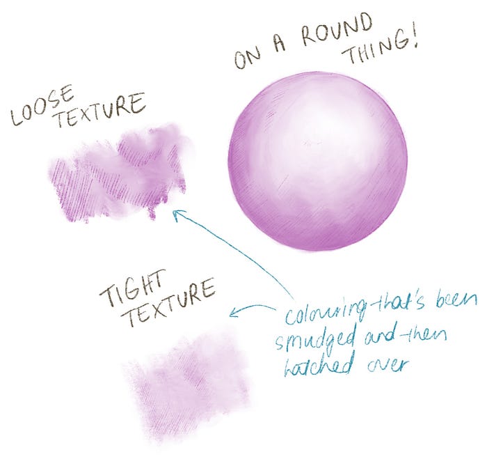
Smudging
What:
Smudging the pigment in your drawing around in a controlled (or not so controlled, depending on the art style) way. This gives a beautifully soft and subtle style of shading that can look very realistic or very spontaneous depending on how it’s used. When the grain of the paper comes through, this shading technique can look very realistic as the paper grain texture can give it a skin-like effect.
How:
You can use plenty of different tools to smudge, like the tip of your finger, a soft eraser, Q-tips, cloth, tissues, or brushes. It’s generally recommended not to use your finger to smudge, since the oils in our skin can make it hard to erase later. You can use different movements to get different effects as well — smudging in small circular motions will have a different look to dragging the pigment out in long lines, for example.
Keep in mind that when you’re smudging, you’re redistributing colour unlike the other techniques, where you’re adding colour. This means you can either add a little more pigment at the start with this in mind, or just be prepared to go over your piece a few times until you get the darkness you want.
Pros and Cons:
Can be fast and fun to do, great for making expressive pictures that have a lot of movement in them even though it’s also great for realism. It can get messy fast though, and can be hard to control a smudge or predict what it will look like if you’re not practised. It can also require more tools than the other techniques, which all just require pencil.
Contour Lines
What:
A more expressive and abstract style of creating shade in drawings where you use a repeated pattern of flowing, curved lines. It emphasises the shape of your drawing as well as adding texture and shade.
How:
Find the shape and direction of the object you’d like to shade and create a few lines throughout the shape, then fill in the space between the lines. It doesn’t have to be perfectly even and they don’t have to follow the shape perfectly either. As long as the lines aren’t straight and generally follow the shape, it’s enough.
Pros and Cons:
Can produce a very textured and interesting image fairly quickly, but you can’t really do hyperrealism with this style. It’s also fairly uncommon so it’s a nice way to make your art stand out. It can however be a bit difficult if you aren’t accustomed to drawing flowing lines.
Scribbling
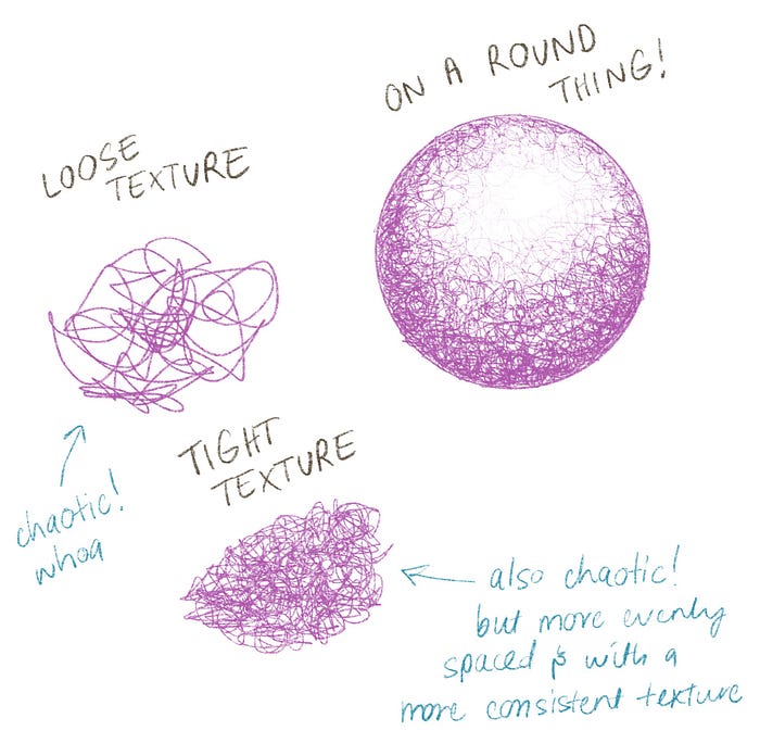
What:
This is similar to scumbling, but it uses scribbles instead of loops and circles. It’s less controlled, so produces a more chaotic and dynamic looking image.
How:
Using the same general steps as scumbling, do a preliminary layer of scribble and build layers on top wherever there’s a darker shadow. As with scumbling, the smaller the scribbles the neater it will be, but the point of this style is to have a bit of chaos so you wouldn’t want to make it so neat that the scribbles don’t even look like scribbles.
Pros and Cons:
Since it’s a messier style, it might not be suitable for people who like very polished work. It can be hard to make an image that you’re happy with since scribbling is so variable and it can therefore be hard to predict what the final piece will look like. Scribbling as shading is also not as fast as you might think. It can look very dynamic and it’s a rarely used technique, so your art would stand out a lot. I think it would also look especially interesting if you were using it for animation rather than static drawings — especially for something like rotorscoping!
Mix
What:
Using a combination of the above techniques to offset the the pros and cons of each and develop your own style.
How:
Experiment and play around! See what suits your patience levels and aesthetics and try combining them. Personally I really enjoy the look of smudged colouring with a bit of extra hatching on the top. It gives a lovely soft blend with a visible yet subtle amount of texture.
Pros and Cons:
It’ll take longer (probably) than using just one technique, but it could be much faster too. For example, if you go all out using colouring and cross-hatching over the entire thing, it’ll take ages. But if you use colouring techniques to quickly block out dark areas that aren’t worth cross-hatching (because the darkness means the cross-hatching texture wouldn’t even be visible) and then only cross-hatch the areas that absolutely need it, it’d be faster than doing just cross hatching. Mixing and combining techniques really explodes out your artistic options here, and it can feel really time-consuming and confusing trying to explore all of the visual possibilities here, which could get a bit overwhelming.
At the end of the day, all shading is just mark making. These techniques are common enough to have names because they work well, but you could do pretty much anything you wanted in terms of shading your picture. Instead of using tiny circles to create shade (scumbling) you could draw overlapping layers of tiny stars or hearts. Instead of cross-hatching, you could draw literal crosses all over. Anything goes! It’s great that all of these techniques exist but don’t let knowing about them stop you from experimenting :)
How to Practice
- Start of by shading simple but round shapes, like spheres and cones. Try out each of the techniques on a range of papers and see if there’s a method you favour. If you do, you can lean into it and go forward really focusing on your favoured methods, but if not you can move forward by continuing to be exploratory as you practice more complex things.
- Move on to shading your spheres and cones at different angles, with different lighting directions and intensities so you really get a hang of the basics.
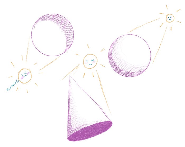
- Move on to more complex objects, like capital letters with rounded edges, folded cloth or household objects like cups and furniture. Capital letters are great to practice with because they have complex shapes that make for interesting lighting, while folded cloth is nice as it forces you to look at how you decide where to put shade and light in a repeated way in a small area. If you decide to try household objects, try not to go for reflective surfaces first as they’re more difficult — start with dull objects and move your way up to glossy, then shiny, then reflective finishes.

- Don’t forget to do the same object with different angles and lighting directions!
That’s It!
As always, good luck with your art adventures — I hope that this guide was helpful to you :) I’ve made a few other art-related guides in a series (learning pathways, graphite pencils, alcohol markers, etc), so leave a comment if there’s anything art-related you’d like me to cover.